> Building Design: Juli 2009

Kamis, 09 Juli 2009

Monolab’s High Rise Tower

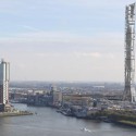
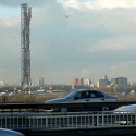
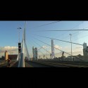
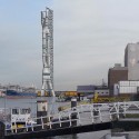
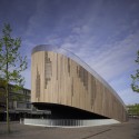
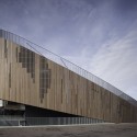
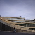
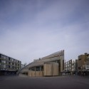
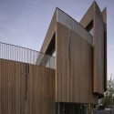
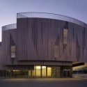
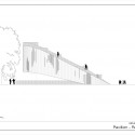
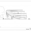
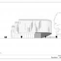
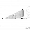
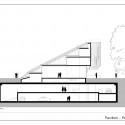
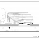
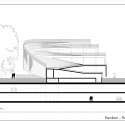
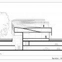
The Dutch firm Monolab has designed a tower to rise 450 meters out of Rotterdam’s Maas Harbour. Noting the city’s existing buildings as being “primitive and of mediocre quality,” the firm seeks to introduce “an ambitious and pragmatic” structure to the city.

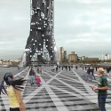
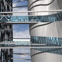
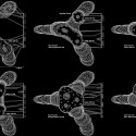
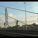
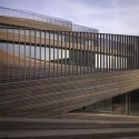
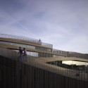
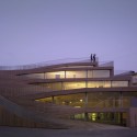
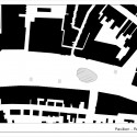
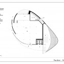
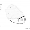
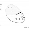
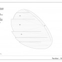
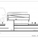
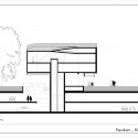
Monolab has shifted their tower into the water of the Maas harbour to minimise wind and shadow effects. A network of walkways would connect the tower to the land.

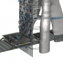
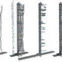
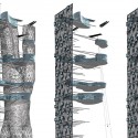
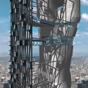
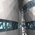
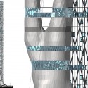
The tower is layered with escape tubes inside the lateral structure of the tower, the elevators connecting to the structural grid system, and the sky lobbies connecting the exterior grid to the inner tower. The façade is clad in photovol glass that harnesses solar energy to power the building. The grid is structurally stabilized with the help of the sky lobbies that connect to the tower.

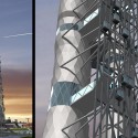
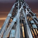
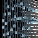
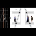
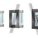
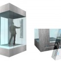
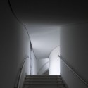
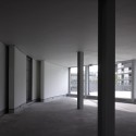
Circulation elements, such as stairs and elevators, are placed on the exterior of the building, leaving uninterrupted floor plans for offices, residential and special commercial programs. The elevators make a “cloud of gondolas”, strategically moving up, down and diagonally for passing. The varying speeds and differing directions allow each elevator to find its own path to a requested address. This creates a vertical highway and a dedicated logistical matrix. Each elevator moves individually and is powered by two electric engines. An interactive touch screen, embedded in the glass of the elevator, allows the user to choose a destination. An inter-communication system will be implemented to avoid congestion. During the evening, the tower’s LED covered skin will display the activity of the elevators with their changing movements resembling moving light particles.

Mixed Use Tower / Moho Architects

Spanish firm Moho Architects are currently in the schematic design phase of a mixed use tower for San Jose, Costa Rica. The tower, whose programmatic elements will range from commercial and retail spaces to offices and hotels, aims to create a strong model of sustainability for the region that will promote eco-friendliness.

The building’s form is conceived of as independent strips that begin to peel away from each other as the tower rises. Voids are punched through the form to create viewing platforms and a space to add greenery. The shifting of these strips allows natural light to flood the interior spaces and nurture the vegetated sky courts.

The façade’s wooden brise-soleil filters solar gain while its layered composition reduces the air-conditioning load. Since the design allows so much light to pass through the space, the need for artificial lighting is nearly eliminated. By providing a variety of activities in one building, the reliance on transportation is reduced dramatically since both day and night time activities reside in one area.

It is the hope that after this tower is constructed, its success will promote the notion of incorporating sustainable ideas into all structures in the area.


General Information
Location: Bulevar Las Américas, Sabana Norte, San José, Costa Rica.
Architecture: Moho architects.
Built surface: 28.000 sqm
Preliminary drawings: December 2008

Roosendaal Pavillion / René van Zuuk Architekten

Architect: René van Zuuk Architekten
Location: Roosendaal, the Netherlands
Client: Gemeente Roosendaal / NL
Design Team: René van Zuuk, Jorrit Spel, Chimo Villa Belda
Program: Pavillion - shops/lunchroom/office / entrance for parking area
Project Year: 2005-2009
Constructed Area: 620 sqm
Photographs: Christian Richters

In 2001 the city of Roosendaal (a provincial town in the southwest of the Netherlands) decided to ban cars from the New Market in the centre of town by building a huge two storey underground parking. In order to create a new public square the city of Roosendaal asked the urban design office Quadrat to make a proposition. In their scheme they proposed to pave the square with red and brown brick, plant 15 trees, make three exits for the underground parking and as the most visible and important element they proposed a restaurant and coffee pavilion in the form of an oval.

In 2005 a public design and construction bidding for contractors was organised. Just before they had to submit their entry to the city, the municipality decided to include the pavilion as well. Therefore they asked the office of Rene van Zuuk to make a design for the pavilion including the contract drawings over a very short span (5 weeks), due to these limitations there was no time to make big changes in the urban scheme and the location and the form of the pavilion was copied from the original urban proposal.

The idea behind the urban proposal was that the pavilion would divide the square in two parts in such a way that you would still have the feeling of being on one big square. Because of the market activities which occupy the entire square twice a week, the terraces of the pavilion needed to be placed above the ground floor . Originally the terraces could only be reached by going through the pavilion. Rene van Zuuk decided to make the terraces accessible from the outside of the building as well so you can walk from the square up onto the sloped roof to the terraces letting the roof become a public area. The entrances from the roof to the building are made by cuts in the sloped surface giving every floor its own terrace. The rest of the roof acts as a big stage which allows artists to give a performances in front of the building.

On the south side the pavilion reaches its highest point. This part of the building cantilevers over the main entrance of the parking garage allowing daylight to penetrate deep into the two levels below.

In order to make the cuts in the roof and to accommodate the cantilevering part of the building, the structure is made by a simple braced steel grid of 4.2m x 4.2m and 3 m high.


The orientation of the grid coincides with the location of the entrance of the main shopping passage. This results in a new direction on the square making the space more dynamic. The original square dates from just after the war until the 1970’s, the architecture was cold and the color monotonous. The new urban scheme is warm in nature thanks to the trees and use of brick. It was obvious that the pavilion should blend in with this character and therefore wood was the most appropriate choice of material. Because the quality of most of the original buildings around the pavilion is not that high, the urban scheme and the new pavilion have to work together as a catalyst to upgrade this part of the city.